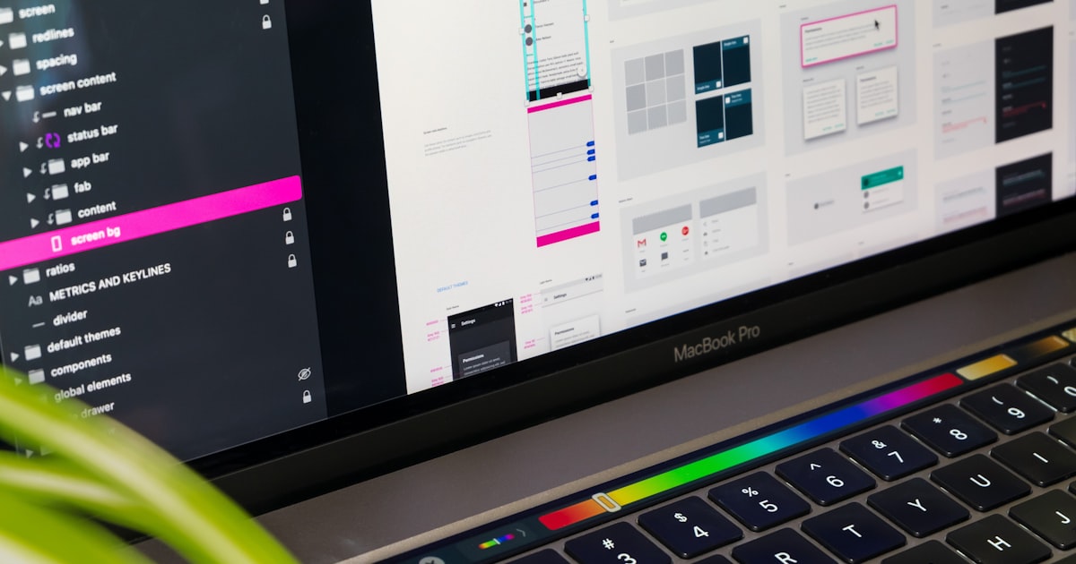
 ← Back to Articles
What'stheDifferenceBetweenUIandUXDesign?APracticalGuide
A beautiful interface with confusing navigation is a UI win and a UX failure — and that gap is where most bad products live.
Ask ten people to explain UI vs UX design and you'll get ten different answers, most of them wrong in the same way: they'll describe UI and stop there, as if UX were just a fancier word for the same thing. It isn't. UI is what a product looks like. UX is whether the product actually works for the person using it — whether they can find what they need, complete the task they came for, and leave without frustration. Confuse the two and you end up paying for a beautiful interface that quietly loses you customers.
Key Takeaways
- ✓UI is the visual layer (colour, typography, spacing, iconography); UX is the full experience (flow, findability, task completion, emotional response).
- ✓A beautiful UI cannot fix a broken flow, and a well-designed flow can't fully overcome an interface people don't trust.
- ✓Businesses often scope 'redesigns' as UI-only projects, then get blindsided when conversion doesn't improve.
- ✓UX work — research, wireframes, flow mapping — should happen before or alongside UI decisions, not after.
- ✓A simple test: if the fix is describable by pointing at one screen, it's UI; if it requires describing a sequence of steps, it's UX.
UI is the surface — and it's more than decoration
User interface design covers everything a person sees and touches on screen: colour palettes, typography, button states, icon sets, spacing, animation, the visual hierarchy that tells someone's eye where to go first. A UI designer decides whether your primary button is solid navy or outlined, whether your form fields have 8px or 16px of padding, whether an error message appears in red text or a red banner.
This work matters enormously for brand perception. A polished, consistent UI signals competence before a visitor reads a single word of copy. But UI on its own says nothing about whether someone can actually get from your homepage to a completed purchase without giving up.
UX is the whole journey, not the screen
User experience design is the discipline of shaping how someone moves through a product to accomplish a goal. It covers information architecture (can they find the pricing page in under two clicks?), flow design (does checkout ask for the right information at the right moment?), content strategy, and the emotional residue left behind — did that process feel effortless or did it feel like a fight?
A UX designer might never touch a colour palette. Their job is closer to a systems thinker: mapping user goals against business goals, running research to find where people get stuck, and restructuring flows so the friction disappears. Good UX is often invisible — nobody praises a checkout flow that just works, they only complain about the one that doesn't.
Tip
Quick test: if you can point at a screen and describe the problem ('the button is too small'), that's usually UI. If you need to describe a sequence of steps to explain the problem ('users add items to cart, then can't find shipping costs until the final step'), that's UX.
UI vs UX design: a concrete side-by-side
Take an e-commerce product page. UI decisions: the font size on the price, whether the 'Add to Basket' button is orange or green, the drop shadow on the product image, how the star rating icons render. UX decisions: whether size and colour options are visible without scrolling, whether shipping cost is disclosed before checkout, whether the page loads fast enough that a mobile shopper doesn't bounce, whether related products actually match purchase intent instead of just being algorithmically 'similar'.
You can nail every UI decision on that page and still lose the sale if the UX is broken — say, if the size selector is hidden behind a dropdown that doesn't work on mobile Safari. Equally, a UX-perfect flow with dated, inconsistent visuals will undersell trust before someone even starts the task. Neither discipline compensates for failures in the other.
Why businesses budget for UI and get blindsided by conversion
This is the pattern we see most often: a business commissions a 'redesign', receives a gorgeous set of Figma screens, ships it, and conversion doesn't move — sometimes it drops. The brief was scoped as a visual refresh from the start. Nobody tested the checkout flow with real users, nobody audited the navigation against actual site analytics, nobody asked why people were abandoning the form on step three.
It's an easy trap because UI is easy to evaluate in a meeting — you can look at a mockup and have an opinion. UX problems only surface when real people, under real pressure, with real distractions, try to use the thing. That requires research, not taste. If you want a sense of what that looks like practically, our guide on running a usability test on a small budget walks through exactly how to catch these problems before launch, without hiring a research agency.
How the two disciplines actually work together
In a properly run project, UX work comes first — or at least in parallel from day one. That means user research, competitor flow audits, wireframes, and prototype testing before a single final colour is chosen. UX defines the skeleton: what pages exist, what each one needs to accomplish, what order information appears in. UI then dresses that skeleton in a visual language that reinforces the brand and makes the intended path obvious.
The two disciplines feed each other constantly. A UX researcher might find users hesitate on a pricing page because they can't tell which plan is recommended — that's a UX finding, but the fix (a highlighted card, a 'Most Popular' badge, contrast on the CTA) is executed in UI. This is why the best teams treat UI and UX as one continuous process rather than a relay race with a handoff document in the middle.
If your site's numbers aren't moving despite a recent visual refresh, it's worth reading our breakdown of UX mistakes quietly killing conversion rate — most of the seven issues on that list are invisible in a screenshot but obvious in analytics.
Signs you're only getting UI when you need UX too
- ◆Your 'redesign' brief only mentions look and feel, brand refresh, or modernising the visuals
- ◆Nobody on the project has looked at your analytics, heatmaps, or support tickets before proposing changes
- ◆There's no plan to test the new design with real users before it ships
- ◆Wireframes were skipped entirely and the project jumped straight to high-fidelity mockups
- ◆Success is being measured by internal opinion ('the team loves it') rather than task completion or conversion data
If any of those sound familiar, it's worth a conversation before you commit budget. Our UI/UX design services are built around research-first process precisely because visual polish without behavioural evidence is a coin flip on results. And if it's been a while since anyone looked hard at the whole site, our piece on 12 signs your website needs a redesign is a useful gut-check before you scope the next project.
Want a second opinion on whether your current site's problem is UI, UX, or both? Get in touch and we'll tell you honestly, before you spend a penny on a redesign.
Keep Reading
7 UX Mistakes That Are Quietly Killing Your Conversion Rate
None of these seven mistakes look dramatic in a screenshot. All seven show up clearly in your analytics.
How to Run a Website Usability Test Without a Big Budget
Five users, one afternoon, zero budget for a research lab — and you'll still catch most of what's broken.

12 Signs Your Website Needs a Redesign (Not Just a Refresh)
Most businesses redesign too early or far too late. These are the actual signals worth acting on.