Every year brings a fresh list of branding trends, and most of them fade. For 2027, the bigger forces are clearer than the fashions: AI making generic design free, AI assistants deciding which brands get recommended, and customers who trust people more than logos.
Here's what we expect to last, what to skip and what it means for a small business.
1. Human craft as a counter to AI sameness
When anyone can generate a polished logo, stock-style illustration or tidy website in seconds, polished-but-generic looks cheap. The brands standing out show visible human decisions:
- Custom or modified typefaces rather than default fonts.
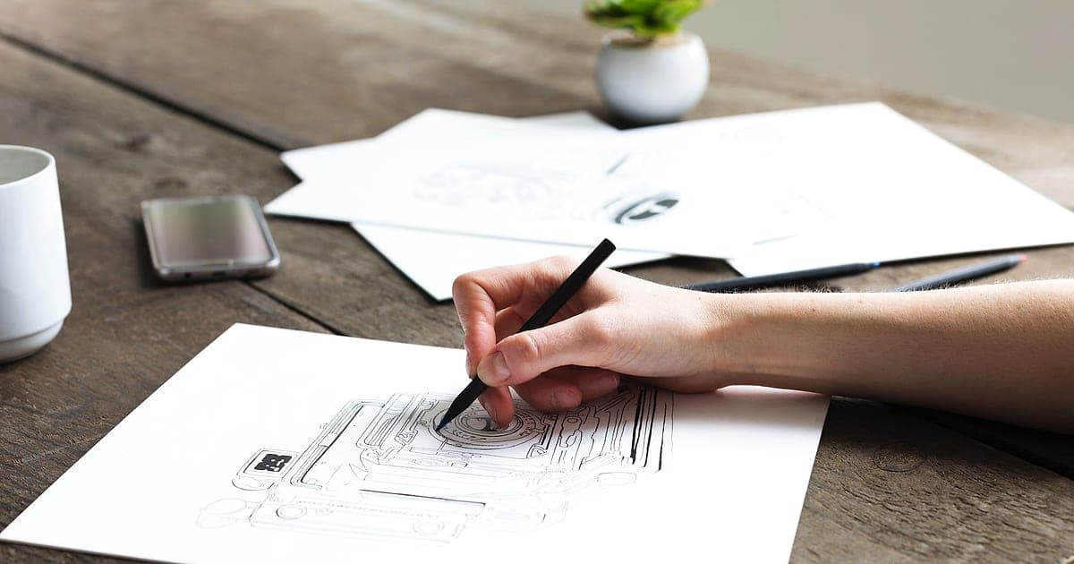
- Hand-drawn elements, real photography and imperfect textures.
- Distinctive colour combinations rather than safe gradients.
- Specific, opinionated copy instead of interchangeable phrases.
Takeaway: use AI to speed up work, but make sure the final identity contains choices only you would make. Our guide to brand identity vs logo explains the difference.
2. Brands built to be described by AI
AI assistants now summarise and recommend brands in a sentence or two. If your positioning is vague, the AI's description of you will be vague too, or it'll describe a competitor instead.
- A crisp positioning statement: who you serve, what you do, why you're different. See how to write a brand positioning statement.
- Consistent descriptions across your website, profiles, directories and reviews.
- Mentions in credible places. Read brand mentions are the new backlinks.
Takeaway: brand strategy now has an SEO side. Clarity is visibility.
3. Founder-led and people-first brands
Customers increasingly follow people, not companies. Founders sharing real work, opinions and behind-the-scenes decisions build trust faster than polished corporate content. Social platforms reward original, personal posts; LinkedIn in particular now screens out generic AI-written content.
Takeaway: decide who the human face of your brand is. Read founder-led branding.
4. Motion-first identities
Brands are seen more often in video, short-form social and interfaces than in print. Logos and identity systems increasingly include motion: how the logo animates, how elements transition, the rhythm of video edits.
Takeaway: when you refresh your identity, design a simple logo animation and motion rules, kept short and consistent.
5. Bolder colour, used with discipline
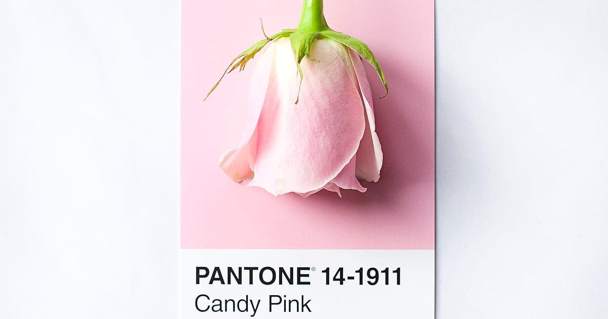
After years of muted minimalism, more brands are using stronger colour, distinctive pairings and colour-led identities. The difference between bold and messy is a system: a primary colour that owns your brand, a few supporting colours and clear rules for each.
Takeaway: pick one ownable colour and use it consistently. Read colour psychology in branding and check contrast with our colour contrast checker.
6. Accessible by default
With accessibility laws such as the European Accessibility Act in force, brand systems need accessible colour contrast, readable type sizes and alternatives to colour-only meaning built in from the start, not patched in later. See European Accessibility Act.
7. Adaptive and dark-mode-ready identities
Brands now live in light and dark interfaces, tiny app icons, smartwatch screens and large billboards. Flexible logo systems (full logo, wordmark, symbol) and dark-mode colour variants are standard. See dark mode design.
8. Values with proof, not slogans
Customers are sceptical of vague claims about sustainability or purpose. Brands that show specific actions, numbers and certifications earn trust; those that rely on slogans increasingly attract criticism and, in some countries, regulatory scrutiny for greenwashing.
Trends we'd skip
| Trend | Why to skip |
|---|---|
| Generic AI-generated mascots and illustrations | Look like everyone else's |
| Over-the-top glass effects on everything | Readability and accessibility problems. See Liquid Glass |
| Rebranding just to look "modern" | Loses recognition you've built |
| Copying a big tech brand's style | Makes you look like a follower |
| Trend-driven logo redesigns every year | Erodes consistency |
What this means for your brand in 2027
- Sharpen positioning so people and AI can describe you in a sentence.
- Audit consistency across website, social, profiles and directories.
- Add human craft: real photos, custom details, a distinctive voice.
- Plan for motion and dark mode in your identity system.
- Bake in accessibility.
- Put a person at the front of your brand.
Most small businesses don't need a full rebrand to do this. A refresh and a brand style guide often do the job. Not sure? Read how to know it's time to rebrand.
The short version
The lasting branding trends for 2027 are human craft against AI sameness, brands built to be described clearly by AI assistants, founder-led voices, motion identities, disciplined bold colour, accessibility and adaptive systems. Skip generic AI visuals and change for its own sake. Clarity and consistency matter more than any visual fashion.
Planning a brand refresh? Our branding team builds identities that stand out and stay consistent. To see what fits your taste, try the free Taste Genome.