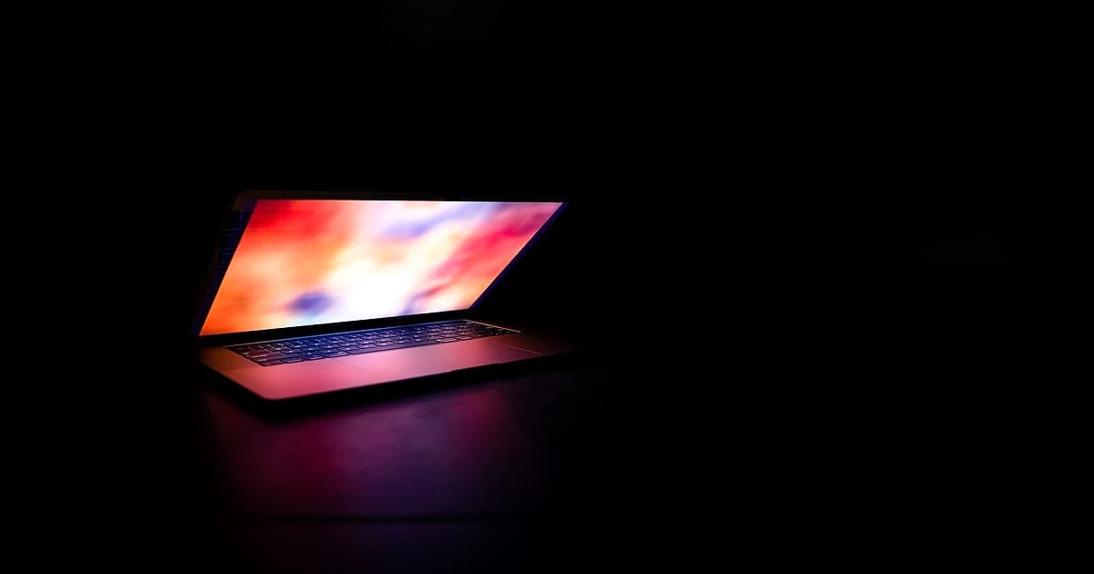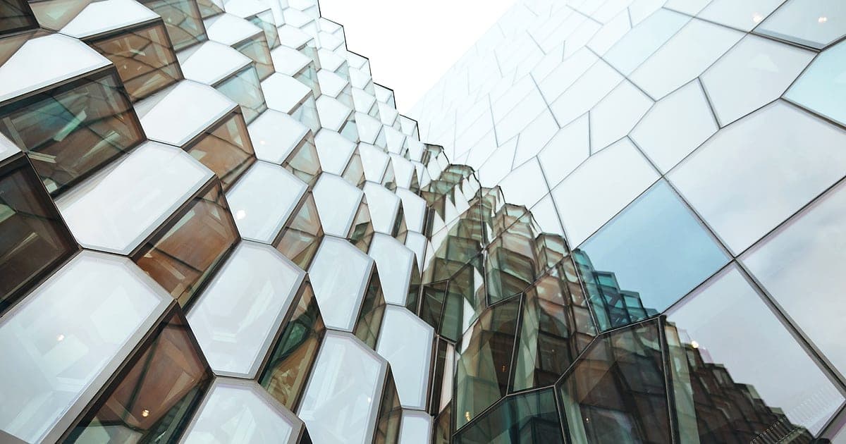
When Apple introduced Liquid Glass at WWDC in June 2025, it changed the look of iOS, iPadOS, macOS, watchOS and tvOS in one go. Buttons, tab bars and menus became translucent pieces of "glass" that refract and reflect the content behind them. Within months, designers everywhere were asking whether their apps and websites should follow.
The answer: borrow the ideas carefully, not the effects wholesale.
What Liquid Glass actually is
Liquid Glass is a material, not just a blur. Apple's version:
- Refracts and reflects content behind it, with highlights that respond to movement.
- Adapts to light and dark content underneath, changing tint and opacity.
- Floats above content: navigation and controls sit on a separate layer.
- Morphs: controls expand, shrink and merge fluidly.
- Gets out of the way: bars shrink when you scroll so content takes the space.
It builds on glassmorphism, a web and UI trend from around 2020 that used frosted, blurred translucent panels.
Where glass works
| Use | Why it works |
|---|---|
| Floating navigation bars and tab bars | Content stays visible underneath; context is kept |
| Media controls over video or images | Controls don't block the visual |
| Overlays and sheets | Shows that you're still "in" the previous screen |
| Small badges and chips over imagery | Readable while keeping the image visible |
Where glass fails
| Use | Problem |
|---|---|
| Large content areas and body text | Readability drops as backgrounds change |
| Forms and data tables | Glass adds noise to tasks that need focus |
| Busy, high-contrast backgrounds | Text contrast becomes unpredictable |
| Low-end devices | Blur effects hurt performance and battery |
| Every surface at once | Nothing stands out; the hierarchy disappears |
Early versions of iOS 26 drew criticism for legibility problems, and Apple added options to make glass more opaque. That's the main lesson: translucency must never cost readability.
Accessibility rules for glass
- Meet contrast in the worst case. Check text contrast against the lightest and darkest backgrounds it could sit on, not the ideal screenshot. Use our colour contrast checker.
- Add a solid fallback. Increase opacity or add a tinted backing behind text.
- Respect "reduce transparency" and "reduce motion" settings. On the web, use the prefers-reduced-transparency media query where supported and prefers-reduced-motion for animated effects.
- Keep focus states visible on glass buttons.
- Don't rely on blur to separate layers. Use borders, shadows or spacing as well.
More in our WCAG 2.2 checklist.
Implementing glass on the web
The core CSS is simple:
.glass {
  background: rgb(255 255 255 / 0.6);
  backdrop-filter: blur(16px) saturate(160%);
  border: 1px solid rgb(255 255 255 / 0.4);
}
@media (prefers-reduced-transparency: reduce) {
  .glass { background: rgb(255 255 255 / 0.95); backdrop-filter: none; }
}
Tips:
- Keep the background opacity high enough for text contrast.
- Limit backdrop-filter to small, fixed elements like headers and floating buttons.
- Provide a dark mode version with its own opacity. See dark mode design.
- Test scrolling performance on a mid-range Android phone.
Should you redesign your app for Liquid Glass?
| Your product | Recommendation |
|---|---|
| Native iOS app | Adopt the system components; they get Liquid Glass automatically and feel native |
| Cross-platform app | Use platform conventions where your framework supports them; don't force iOS glass onto Android |
| Website or web app | Use glass sparingly for floating controls; keep content solid |
| Brand with a distinct visual identity | Adapt the principles (layering, motion, content-first) in your own style |
For native apps, following the platform's own components is usually right: users expect apps to feel at home on their device. Read native vs cross-platform development.
The principles worth copying
Even if you never use a blur effect, Liquid Glass has good ideas:
- Content first: controls shrink and step back when people are reading or watching.
- Clear layers: navigation floats above content in a consistent way.
- Purposeful motion: elements move to explain what's happening, not to decorate. See CSS view transitions.
- Adaptivity: interfaces respond to light, dark and context.
The short version
Liquid Glass is Apple's translucent, adaptive design material for iOS 26 and its other platforms. Glass works for floating navigation, media controls and overlays; it fails for body text, forms and busy backgrounds. Check contrast in the worst case, provide solid fallbacks, respect reduced-transparency settings and use blur sparingly for performance.
Want an interface that looks current and stays usable? Our UI/UX design team designs for both, and our guide to UI vs UX design explains how the two fit together.