01
Debating colours before structure
Reviews of polished designs turn into opinions about shades of blue, while the fact that the sign-up flow has a dead end goes unnoticed.
Every screen and every step mapped out, tested and agreed while changes are still cheap.
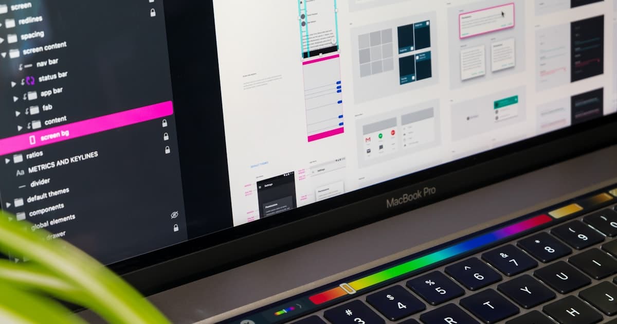
Changing a wireframe takes minutes. Changing a built product takes weeks. We map how people move through your site or app, sketch each screen in greyscale and test the flow, so everyone agrees on how it works before anyone debates how it looks.
The problems we hear most often before someone asks us about wireframes & user flows.
Reviews of polished designs turn into opinions about shades of blue, while the fact that the sign-up flow has a dead end goes unnoticed.
Empty states, errors and edge cases nobody designed show up during development, where they're expensive to solve.
Steps that seem obvious internally confuse new users, who leave halfway through.
Every path a user can take for key tasks, including decisions, errors and alternative routes.
Greyscale layouts showing content priority and interaction, for desktop and mobile.
Real or realistic content in the wireframes, so we design around what people actually read.
Empty, loading, error and success states planned, not left for developers to guess.
Wireframes linked into a simple prototype so you can click through the journey yourself.
Notes on behaviour and logic, so design and development start from the same understanding.
You follow every step live in Mission Control, your project dashboard: tasks, files, approvals and a launch forecast.
We list the jobs users come to do and map the steps for each one.
Fast low-fidelity sketches explore options before we commit to one direction.
Mid-fidelity wireframes for every screen and state, reviewed with you on the page.
A quick round of testing on the clickable flow, then fixes before visual design begins.
Typical timeline, depending on screens
Breakpoints designed: mobile and desktop
Of key flows covered, including errors
Something else on your mind? Ask the Zelvorm Concierge in the corner, or talk to the team.
A wireframe shows structure, content priority and behaviour in greyscale. A mockup adds the visual design: colour, type, imagery and detail. Wireframes come first because structure is cheaper to change.
 UI/UX Design
The 11 elements high-converting landing pages share, from the headline and hero to proof, form design and speed, plus the mistakes that quietly kill conversion.
6 Nov 2026 · 4 min read
 UI/UX Design
Vague feedback means more revision rounds. Here's how to give clear, specific website design feedback: what to say, what to avoid and a simple format designers love.
6 Nov 2026 · 4 min read
 UI/UX Design
UI and UX get used interchangeably, but they're different jobs with different failure modes. A clear, practical explanation with real examples.
9 May 2026 · 5 min read
Next in UI/UX Design
High-fidelity UI design
Tell us what you're building. You'll hear from a human within 24 hours, with an AI Blueprint already waiting.
contact@zelvorm.com · Avg. response under 24h