01
It looks dated next to competitors
First impressions are made in moments. An interface that feels old makes your product seem behind, even if it isn't.
Polished, accessible screens with every state designed and ready for development.
Once the structure works, the interface has to earn trust in a second. We design pixel-perfect screens on a design system: type, colour, spacing and components chosen to make your product clear, accessible and unmistakably yours.
The problems we hear most often before someone asks us about high-fidelity UI design.
First impressions are made in moments. An interface that feels old makes your product seem behind, even if it isn't.
Buttons, spacing and type drift from page to page, making the product feel unpolished and harder to use.
Low contrast, tiny type and decorative layouts fail people with low vision and anyone using a phone outdoors.
Mood and style explorations so you choose a direction before we design every screen.
High-fidelity designs for every screen in scope, for mobile, tablet and desktop.
Hover, focus, active, loading, empty, error and success states, designed rather than improvised.
Colour contrast, type sizes, focus states and touch targets that meet WCAG 2.2 AA.
Purposeful animation specs that make the interface feel responsive without slowing it down.
Organised Figma files, tokens, specs and assets, plus a walkthrough with your developers.
You follow every step live in Mission Control, your project dashboard: tasks, files, approvals and a launch forecast.
Two or three visual directions on real screens, so you can react to something concrete.
We design the key screens first, then extend the system across the rest.
You comment directly on the designs. We iterate in short rounds with clear decisions each time.
Final files, tokens and specs, with a session with your developers to answer questions.
WCAG 2.2 accessibility level we design to
Breakpoints: mobile, tablet, desktop
Visual directions explored before we commit
Something else on your mind? Ask the Zelvorm Concierge in the corner, or talk to the team.
Yes. All our UI design work is done in Figma, organised with components and variables so it's easy for your team to use and extend.
 UI/UX Design
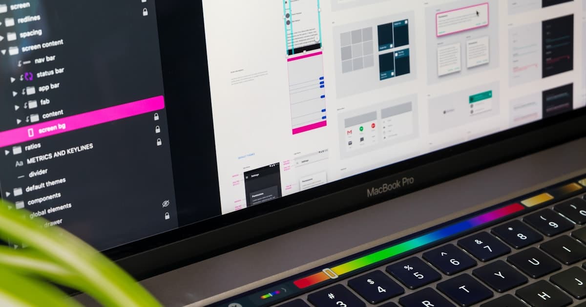
A practical WCAG 2.2 checklist for small business websites: contrast, keyboard access, forms, images, focus, target size and the new 2.2 criteria, in plain English.
6 Nov 2026 · 5 min read
 UI/UX Design
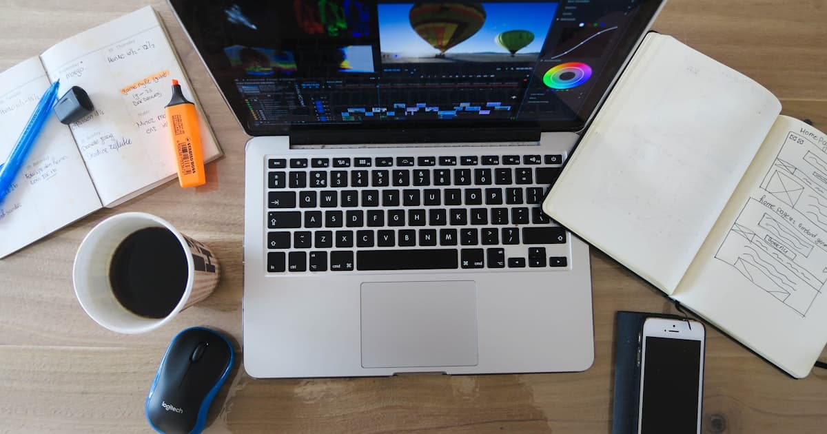
UI and UX get used interchangeably, but they're different jobs with different failure modes. A clear, practical explanation with real examples.
9 May 2026 · 5 min read
 Graphic Design
Consistent visual design isn't a nice-to-have — it measurably increases trust and conversion. Here's the actual mechanism behind why.
5 May 2026 · 5 min read
Next in UI/UX Design
Interactive prototypes
Tell us what you're building. You'll hear from a human within 24 hours, with an AI Blueprint already waiting.
contact@zelvorm.com · Avg. response under 24h